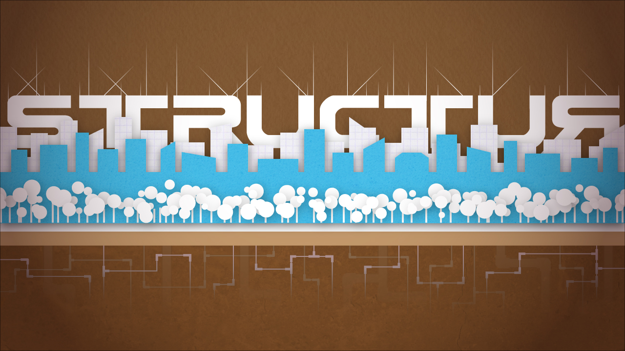


But anyway, on to the breakdown. Adobe Illustrator CS3 was used for the entirety of the piece. The first thing I did was start making the buildings in the middle. Blue, white, and brown is one of my favorite color combinations ever. I think this may be rooted in me seeing a fine lady in a bathing suit with the same color combination, but we're not here to dissect my id. Picking a color scheme at the beginning is a really good idea because it gives you guidance throughout the rest of the piece. I imagine it's sort of like picking a key when composing a song, but I wouldn't really know because I don't understand a single rotten thing about music.
The buildings were an Alt-duplicated rectangle that I edited as I dragged it along. Since the buildings were all the same color, they look like a solid mass. A wide rectangle along the bottom tied the buildings together and gave them that uniform lower roof line. I did the same thing for the background row of buildings along with a third row that I ended up getting rid of. The slight hint of a texture on the buildings was achieved by putting a high-resolution image of a texture (a dirty wall, graph paper, etc) into a layer and then masking that layer off with a copy of the corresponding building layer. The blending mode of the masked texture was then set to a mode that showed the texture, but let the color and brightness of the building layer through, usually Overlay or Multiply, but in this case Soft Light. It's always a nice touch to adjust color and contrast of textures like this in Photoshop to really fine-tune them before dropping them into Illustrator. Photoshop's also good for using the clone stamp or healing brush to get rid of pesky things like pebbles or scratches that distract from the even texture look you might be trying to achieve. Opacity of the texture layers was also adjusted to taste.
The trees were made in two steps. I created a scatter brush that duplicated, scattered, and scaled a circle shape for the treetops. A few different line widths of this and some overlapping drop-shadowed layers helped to set the treetops apart from one another. The second step was to make the trunks, which are just a simple two-point line shape that I alt-duplicated wherever it seemed pleasing to the eye. I then altered their heights accordingly.
A slight drop shadow was added to the building and tree layers to give them that cutout, slightly 3D look that I apparently love and integrate into basically everything I do. It really pushes things off the paper,or into it in the case of the inner shadow on the word "Dropship" in the above piece.
I hopped through fonts for the text and found one pretty quickly. My stand-in text ("TEXTTEXT") can be seen in the previous post. I wanted something big and blocky with some slight curves that repeated both the hard look of the buildings and the roundness of the trees. This particular font is called Earth Normal and I probably got it off of http://www.dafont.com/, knowing me. I added the little lines up top to emphasize the curves and lines in the letters and they started looking like antennae, so I'm pretty happy with how they fit the theme. They consist of three line types: short lines, long lines, and diagonal lines. I alt-duplicated the lines around wherever they seemed to fit and broke up any symmetry between two diagonal lines with offset-from-center vertical lines. I then put a gradient layer mask on the different line layers to make them fade off at the top like they do.
The pipes were an addition at the end. I tried doing a cross-section of the ground, with a subway tunnel, strata, and pipes, but it got too busy and distracting and I cut it all out except for the pipes. I really like how they ended up mirroring the idea of the antenna lines up top. The pipes themselves made me feel really clever. I drew them with the pen tool and gave them rounded corners. I then duplicated the pipe layer and upped its line width (from 2 to 5), made it all transparent, and then revealed only the joint areas in the layer mask. So you get thin little pipes everywhere and thick pipes revealed only on the corner sections, making it look like joints.
I made the ground and sky textures in the same way I did for the buildings. A really great place to find free high-res textures online is http://www.cgtextures.com/. You can download something like 10MB of textures a day and the subject matter is all across the board, from grungy concrete to fine wood. It's a goldmine. Another awesome place is http://urbandirty.com/. Or just go out with a camera and shoot things yourself at as high resolution as your camera will let you. If you have any weird lighting in the things you shoot, use the High Pass filter on them in Photoshop to even everything out.
I put a vignette over the whole thing too to give it that dark edge/bright center kind of look that just makes it look nicer somehow and pulls your eye to the middle of the piece.
As one last note, I want to bring up the Recolor Artwork tool. This feature started in Illustrator CS3 and has proven an invaluable time saver for my designs. You can select any artwork in your composition with more than one color, and even everything in the entire piece if you want to, and hit the little circular Recolor Artwork icon on your top toolbar. The tool basically lets you recolor everything at once. If you immediately click the "Edit" button at the top of the tool, it takes you to a big HSB color wheel. Press the chain link button at the bottom right under the wheel and you can then move the HSB sliders or points on the color wheel around all over the place to recolor everything in the composition at the same time with the colors still staying the same relative to one another on the color wheel. So you can take a composition that's yellow and orange and see what it would look like if it were shifted to red and blue with the same contrast, brightness, and saturation. It's the closest thing Illustrator has to a Hue/Saturation tool. Both the edit and assign sections of this tool are perfect for minor little adjustments to colors and gradients too.
So that's the breakdown! Let me know if you like it and I'll keep it up. In brief NYC news, I'm still packing boxes and looking for a place to live in Brooklyn.
"Why are you doing this?" "The same reason I do everything, Jen. To have sex with a lady." -Roy, The IT Crowd
I LOVE this Chase. Hard to believe this is Illustrator!? Makes me realize I've got some catching up to do. Keep it up and good luck w/Brooklyn :)
ReplyDeleteRenee
You made me blush! And thanks! We gotta swap Recent Designs soon. I love seeing what kinds of awesome things my friends are coming up with. You've made some of my favorite stuff out of all the App designers too, so I'm even more jazzed to see your awesomeness. I'll be significantly closer to Ontario after the move too, so I don't think I'll be able to resist the Canadian draw. I'll let you know when (not if) I visit!
ReplyDeleteThe landfall one is radtastic. A++
ReplyDeleteWonderful! Reading your description of how you created the artwork was like watching a time-lapse video of it being made. And I had no idea the Recolor Artwork tool existed, that's a definite find. Illustrator amazes me with every new version, it's like it's becoming sentient to our needs...perhaps TOO sentient...
ReplyDeleteAnyway the blog is great and I love the artwork (I think Landfall is my favorite). Definitely keep it up!!
Thanks, everybody! I'll keep it up! And yeah, I completely flipped my dick when I found out about Recolor Artwork. I use it for everything now. It's soooo good for subtle changes, especially to complex gradients!
ReplyDelete